A Supporting Information: Co-regulation of paralog genes
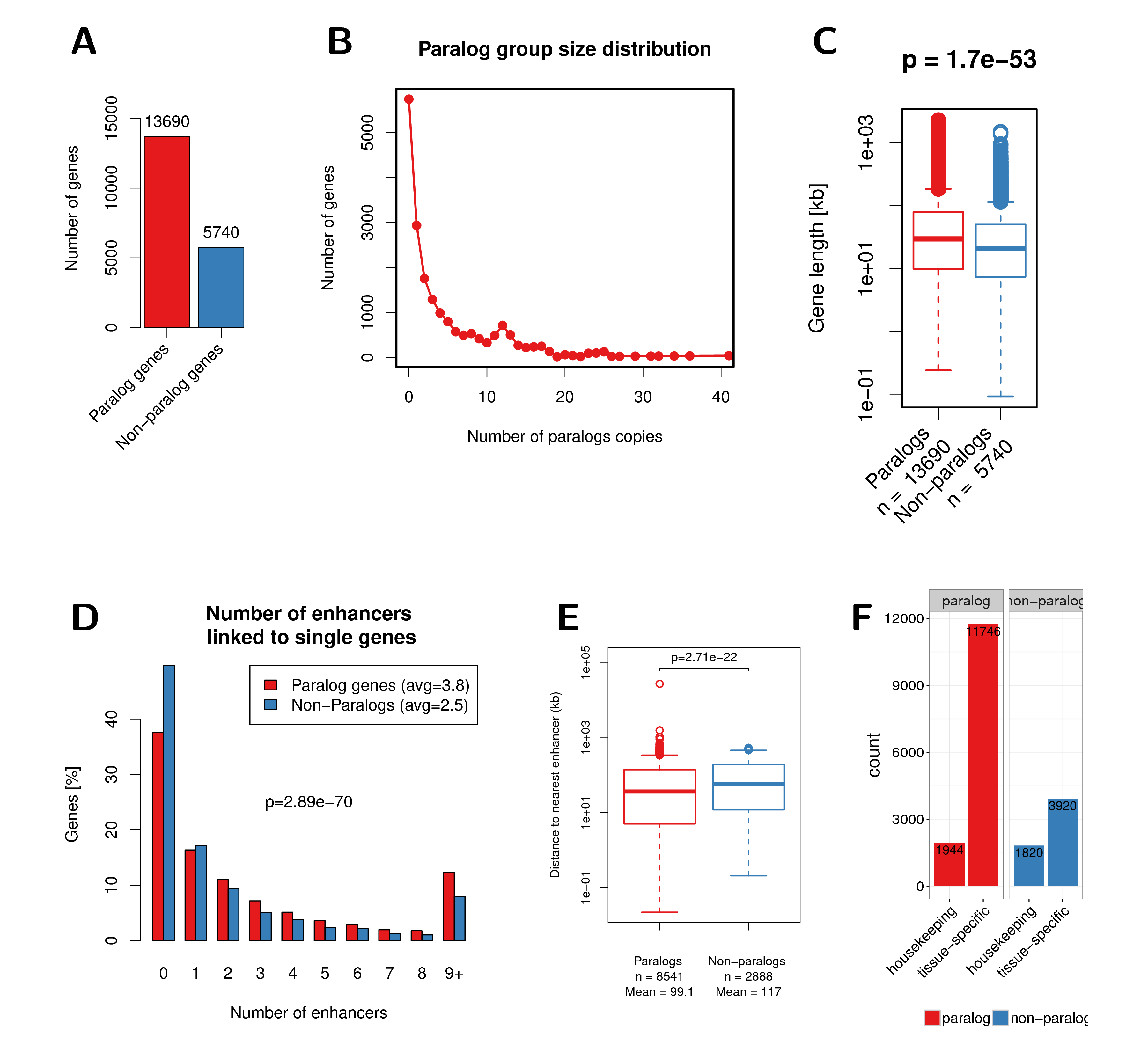
Figure A.1: (A) Number of paralog and non-paralog genes in the human genome. (B) Paralog group size distribution in the human genome. (C) Gene length of paralog and non-paralog genes. (D) Distribution of the number of enhancers linked to single genes compared between paralog genes (red) and non-paralog genes (blue). (E) Genomic distance to nearest enhancer for paralogs and non-paralog genes. (F) Number of housekeeping genes among paralogs and non-paralog human genes. A recently published set of housekeeping genes was used here (Eisenberg and Levanon 2013). The p-values shown in this figure were calculated using the Wilcoxon rank-sum test.
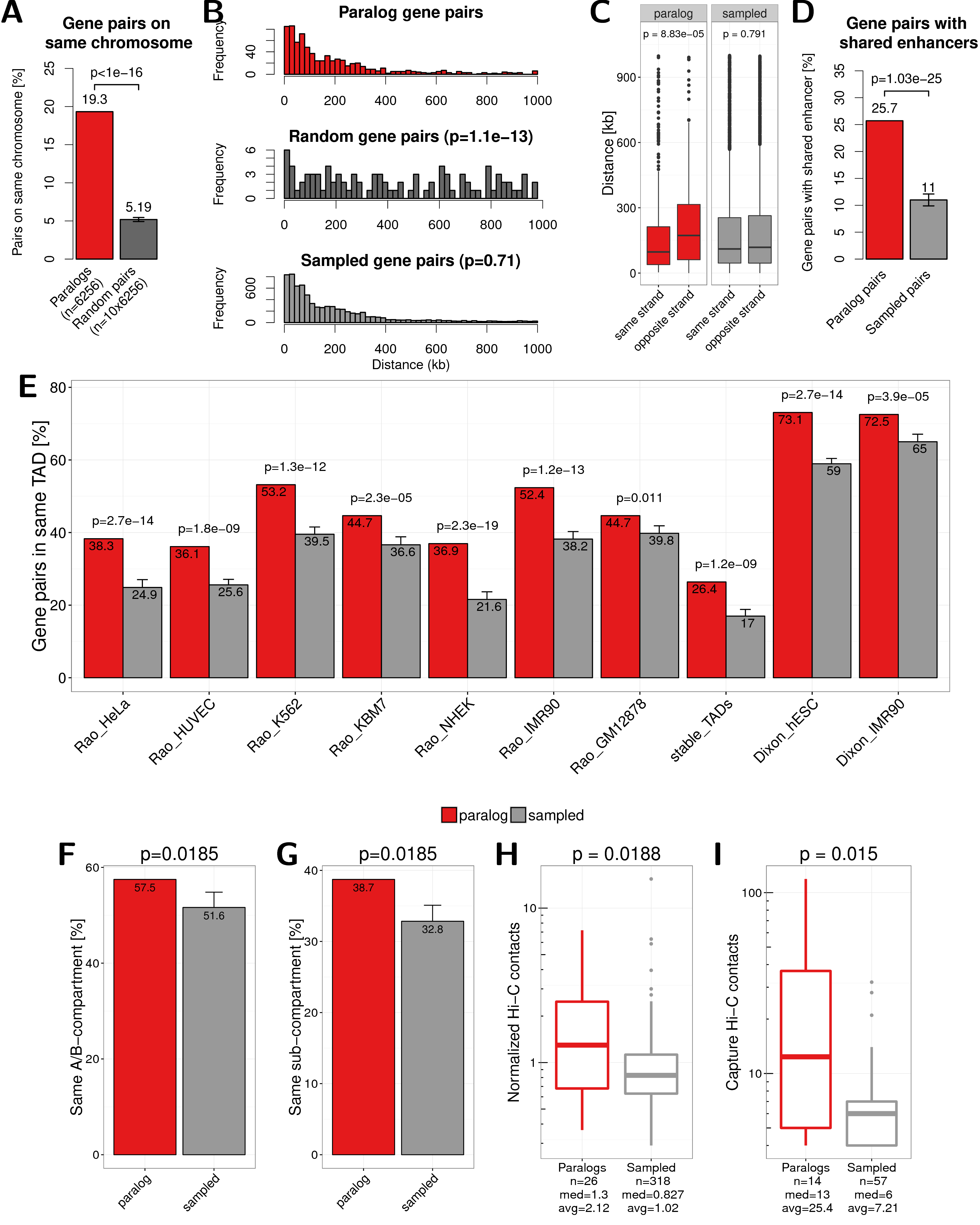
Figure A.2: Main results of this study by changing the selection of paralog pairs from families with more than two paralogs. Here pairs are selected by maximizing the rate of synonymous mutations between them instead of minimizing, as in the main text. (A) Percent of paralogs pairs on the same chromosome compared to random pairs. (B) Distance distribution between pairs of paralogs (red), random pairs (dark grey), and sampled pairs according to the distances of paralogs (grey). (C) Genomic distance between close paralogs and sampled pairs separated by same strand or not same strand of gene pairs. (D) Percent of close paralogs and sampled pairs with at least one shared enhancer. (E) Percent of close gene pairs located within the same TAD for different TAD data sets. (F) Percent of paralog and sampled pairs that are in the same A/B compartment. (G) Percent of paralog and sampled pairs that are in the same subcompartment. (H) Normalized Hi-C contacts between distal paralogs and sampled genes. (I) Promoter capture-C contacts between distal paralogs and sampled genes.
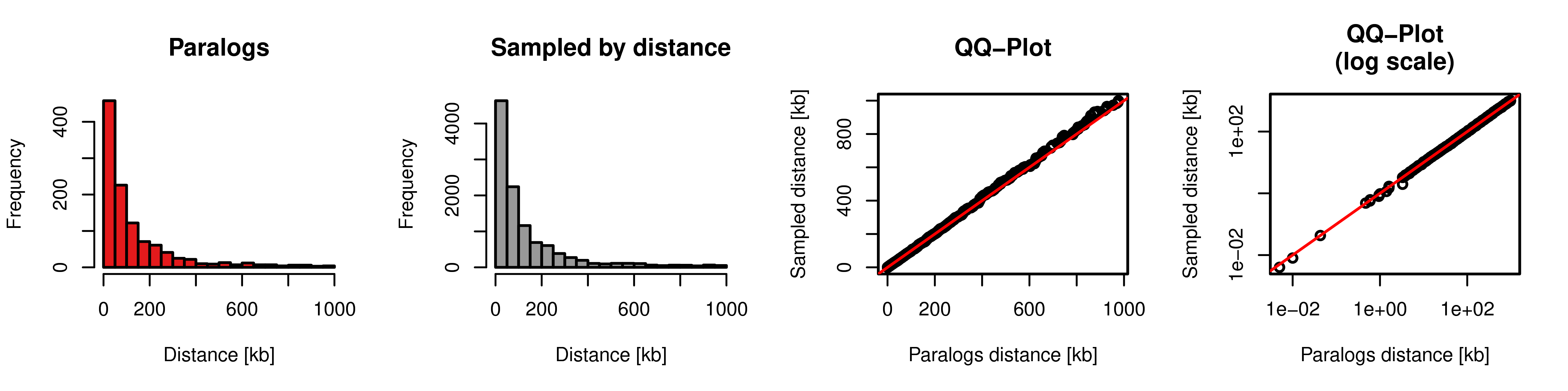
Figure A.3: Sampling of gene pairs by distance. Distance distribution of paralog pairs (red) and sampled background gene pairs (grey) and quantile-quantile plot of these two distributions in linear axis (third column) and log scaled axis (fourth column).
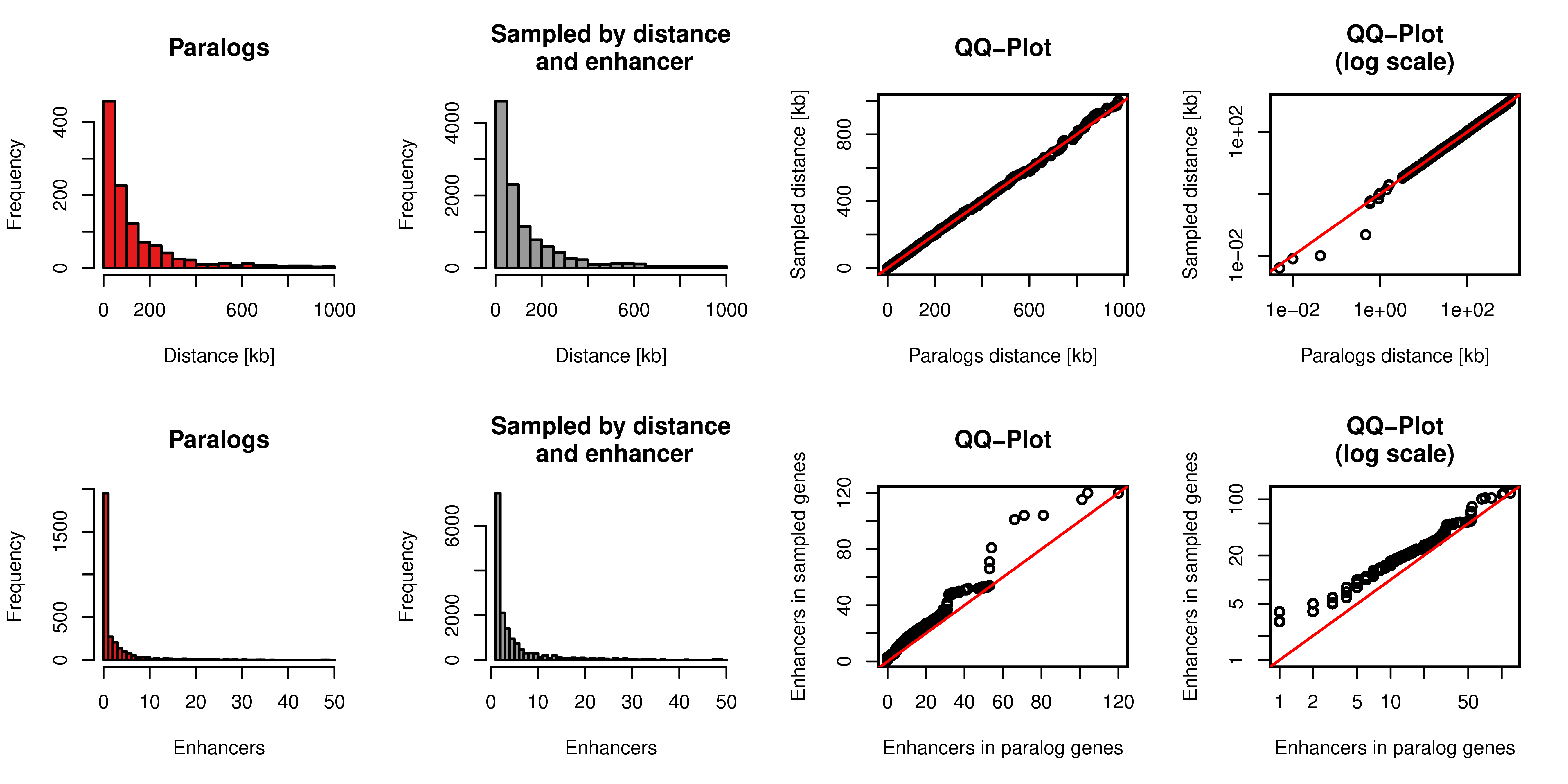
Figure A.4: Sampling of gene pairs by distance and number of enhancers. Top row: Distance distribution of paralog pairs (red) and sampled background gene pairs (grey) and quantile-quantile plot of these two distributions in linear axis (third column) and log scaled axis (fourth column). Bottom row: Distance of the number of enhancers linked to each single gene in the pairs of paralogs (red) and sampled background gene pairs (grey) and quantile-quantile plot of these two distributions in linear axis (third column) and log scaled axis (fourth column).
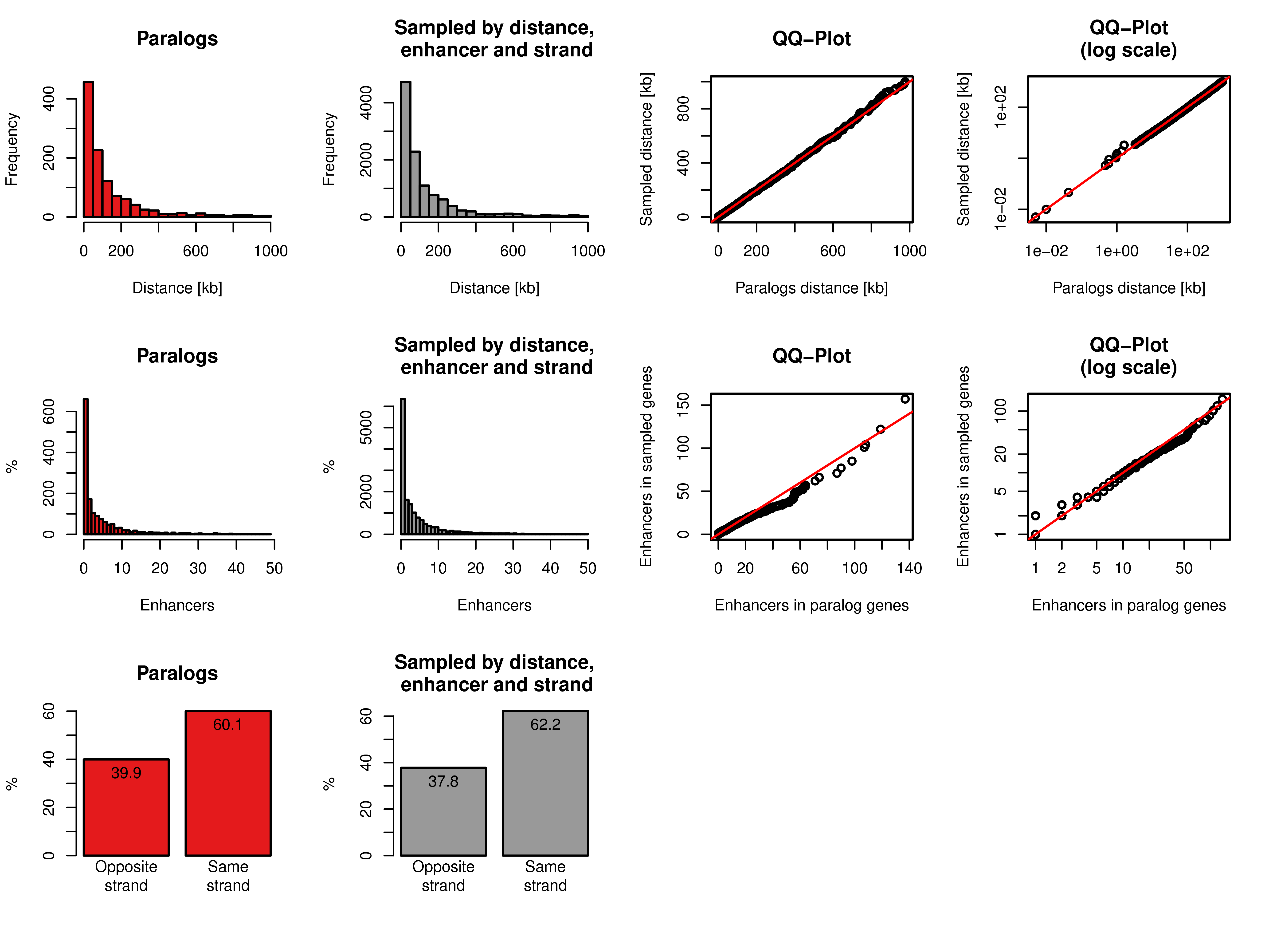
Figure A.5: Sampling of gene pairs by distance, number of enhancers, and same strand frequency. Top row: Distance distribution of paralog pairs (red) and sampled background gene pairs (grey) and quantile-quantile plot of these two distributions in linear axis (third column) and log scaled axis (fourth column). Middle row: Distance of the number of enhancers linked to each single gene in the pairs of paralogs (red) and sampled background gene pairs (grey) and quantile-quantile plot of these two distributions in linear axis (third column) and log scaled axis (fourth column). Bottom row: Percentages of pairs of genes with opposite or same strand of transcription for paralog pairs (red) and sampled pairs (grey).
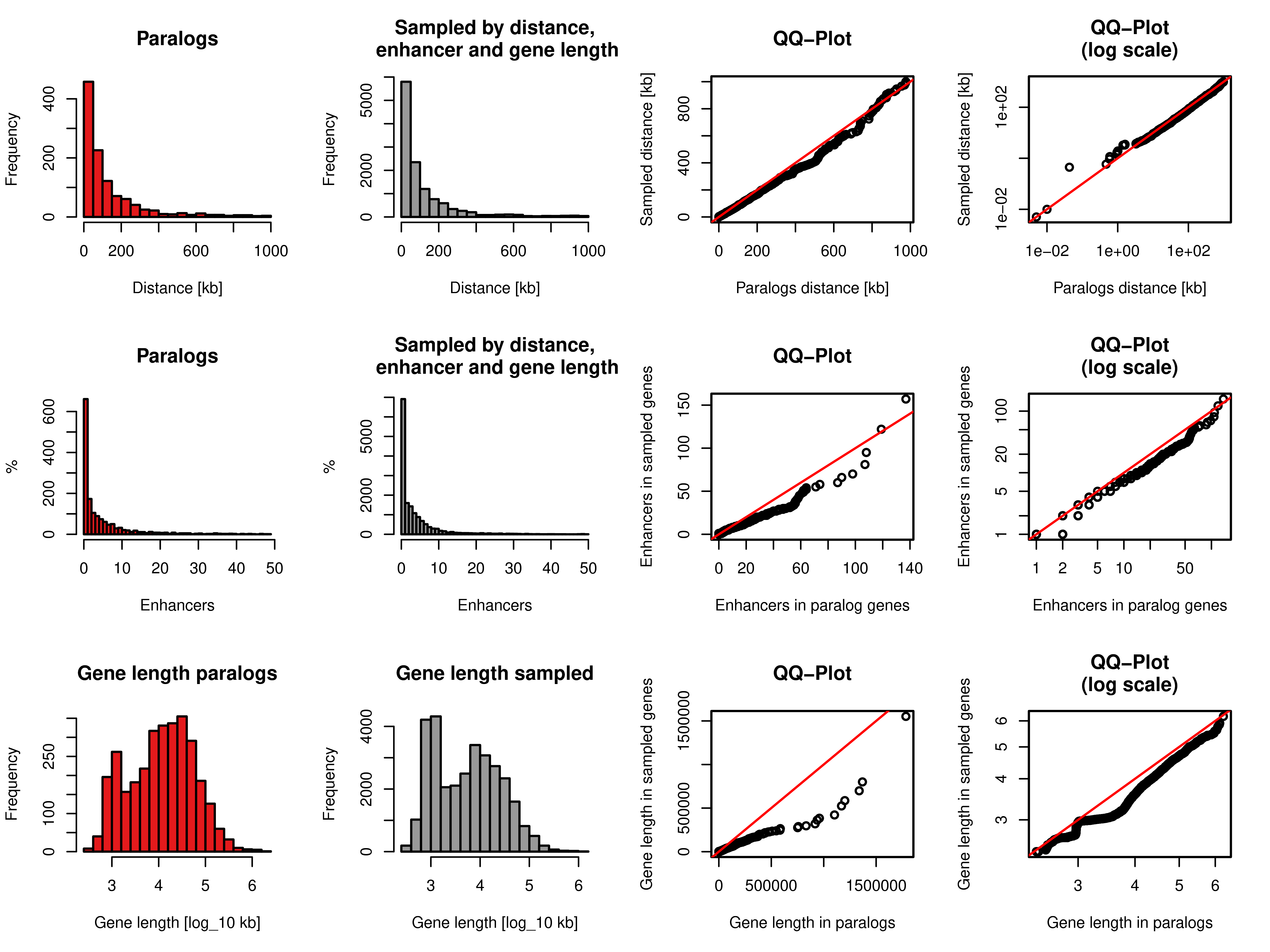
Figure A.6: Sampling of gene pairs by distance, number of enhancers, and same strand frequency. Top row: Distance distribution of paralog pairs (red) and sampled background gene pairs (grey) and quantile-quantile plot of these two distributions in linear axis (third column) and log scaled axis (fourth column). Middle row: Distance of the number of enhancers linked to each single gene in the pairs of paralogs (red) and sampled background gene pairs (grey) and quantile-quantile plot of these two distributions in linear axis (third column) and log scaled axis (fourth column). Bottom row: Distribution of gene lengths of each single gene in the pairs of paralogs (red) and sampled background gene pairs (grey) and quantile-quantile plot of these two distributions in linear axis (third column) and \(\log_{10}\) of gene lengths (fourth column).
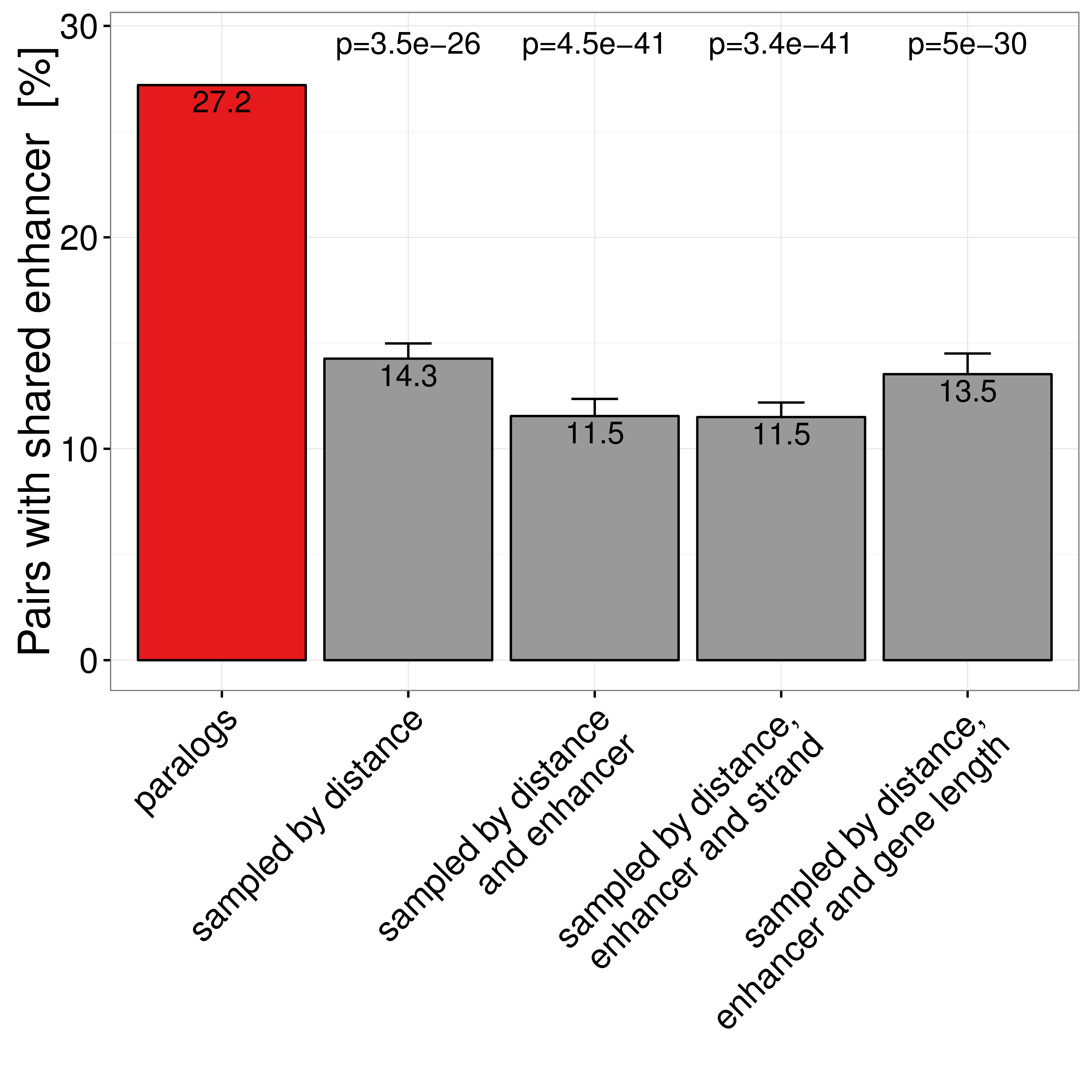
Figure A.7: Percent of gene pairs with at least one shared enhancer in paralog pairs and four different types of sampled gene pairs. Only pairs with TSS distance \(\leq\) 1Mb are considered. Error bars indicate standard variation of ten times replicated sampling.
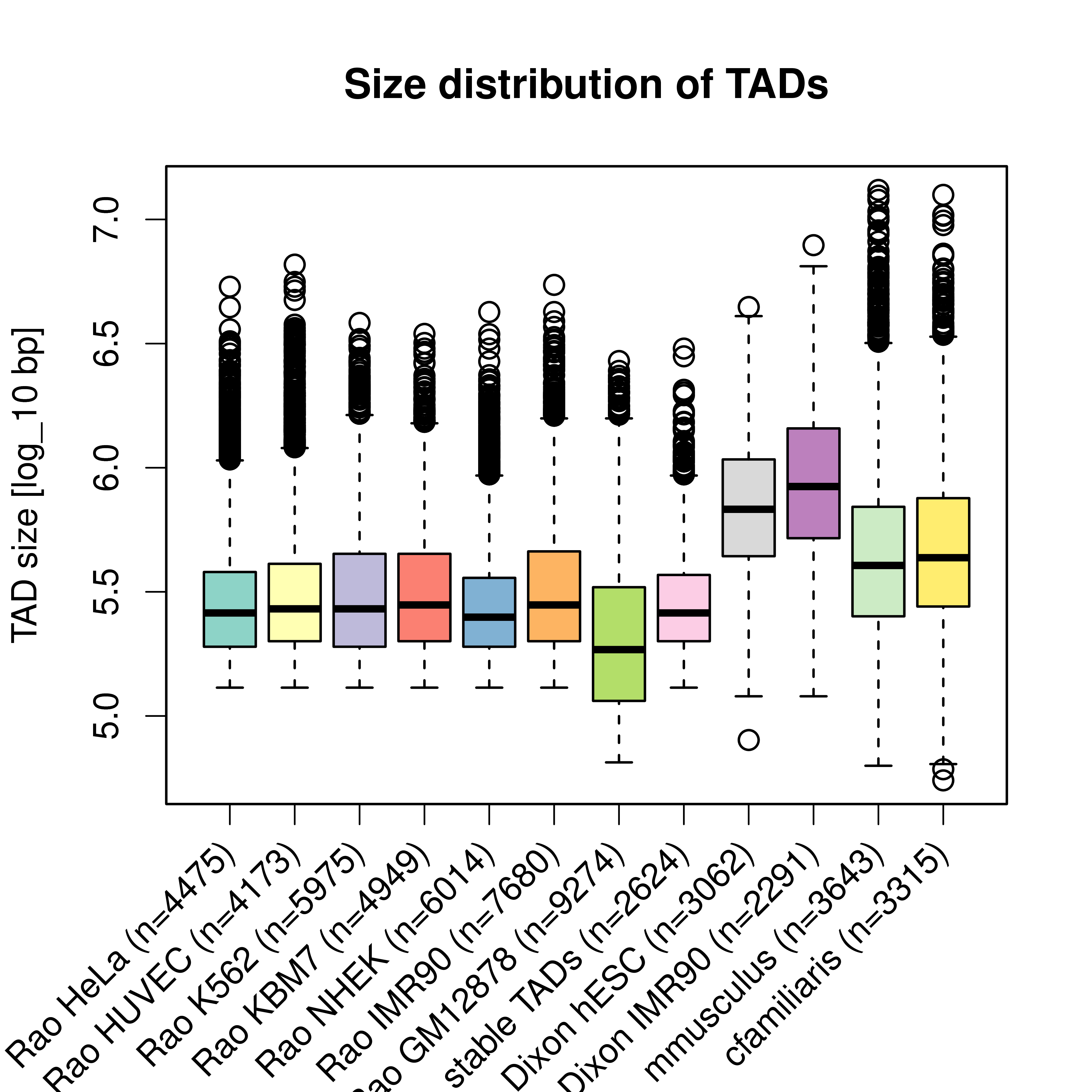
Figure A.8: Size distribution of TADs in different cell-types, studies, and species. Each box shows the size-distribution of one data set of TADs. The labels indicate the study (Rao (Rao et al. 2014), or Dixon (Dixon et al. 2012)), cell type and number of TADs in each data set. The last two boxes are for TADs from Hi-C experiments in mouse and dog Hi-C liver cells (Vietri Rudan et al. 2015).
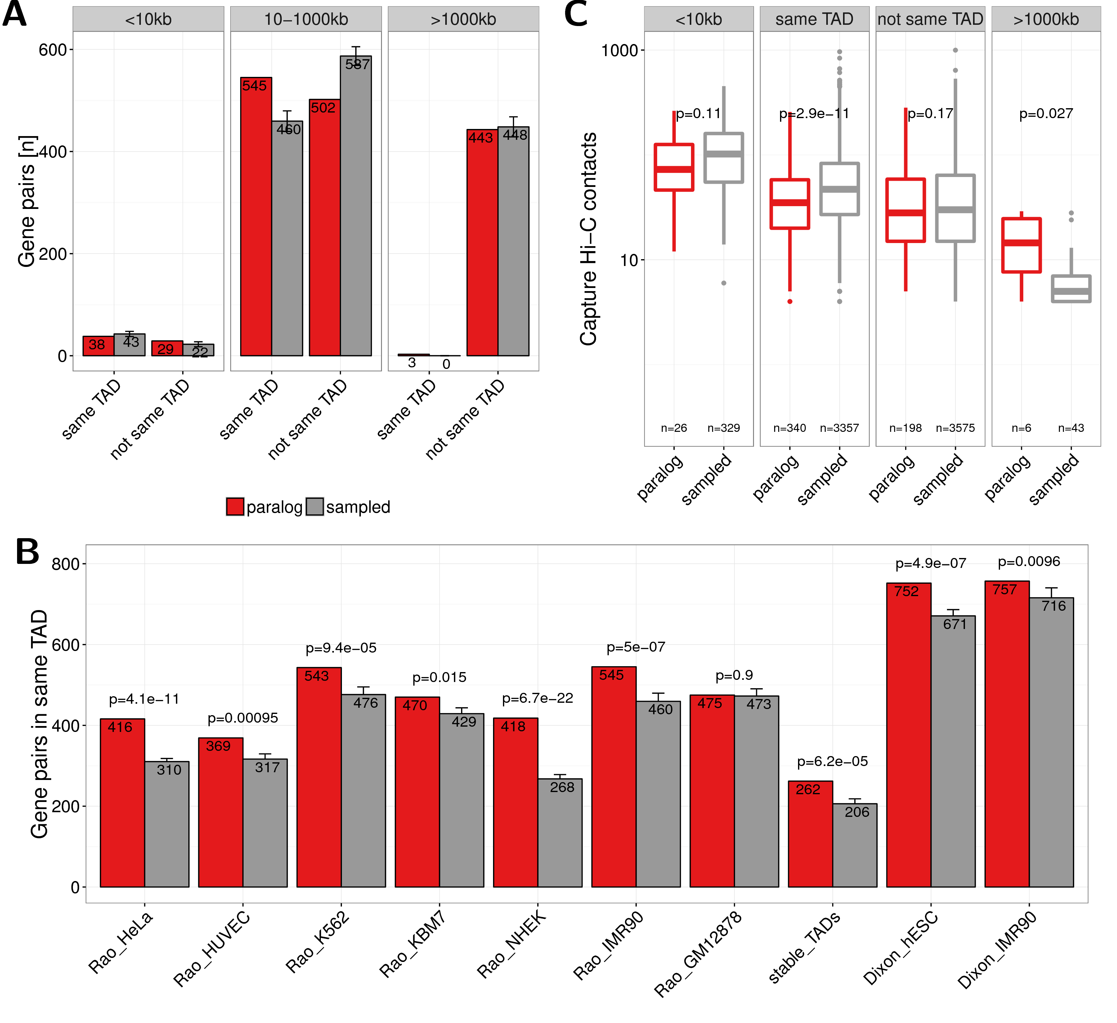
Figure A.9: (A) Number of paralog (red) and sampled (grey) gene pairs that are in the same TAD or not separated in three groups of genomic distances (0-10kb, 10-1000kb and \(>\) 1000kb). TADs called from IMR90 cells by (Rao et al. 2014) were used here. (B) Co-localization of gene pairs with genomic distances between 10kb and 1000kb within the same TAD for paralogs and sampled gene pairs and separated by TAD data sets from different cell types and studies. The first seven bars show values for TADs called in HeLa, HUVEC, K562, KBM7, NHEK, IMR90, and GM12878 cells by (Rao et al. 2014). The eighth bar shows the value for stable TADs across cell types form this study (at least 90% reciprocal overlap in 50% of cells). The last two bars show data for TADs called in hESC and IMR90 cells by (Dixon et al. 2012). Error bars indicate standard deviation in 10 times replicated sampling of gene pairs. P-values are computed using Fisher’s exact test. (C) Promoter capture-C contacts between pairs of paralogs (red) and sampled gene pairs (grey) for the groups: $<$10kb genomic distance, located in the same TAD, not in the same TAD, and with genomic distance $>$1000kb.
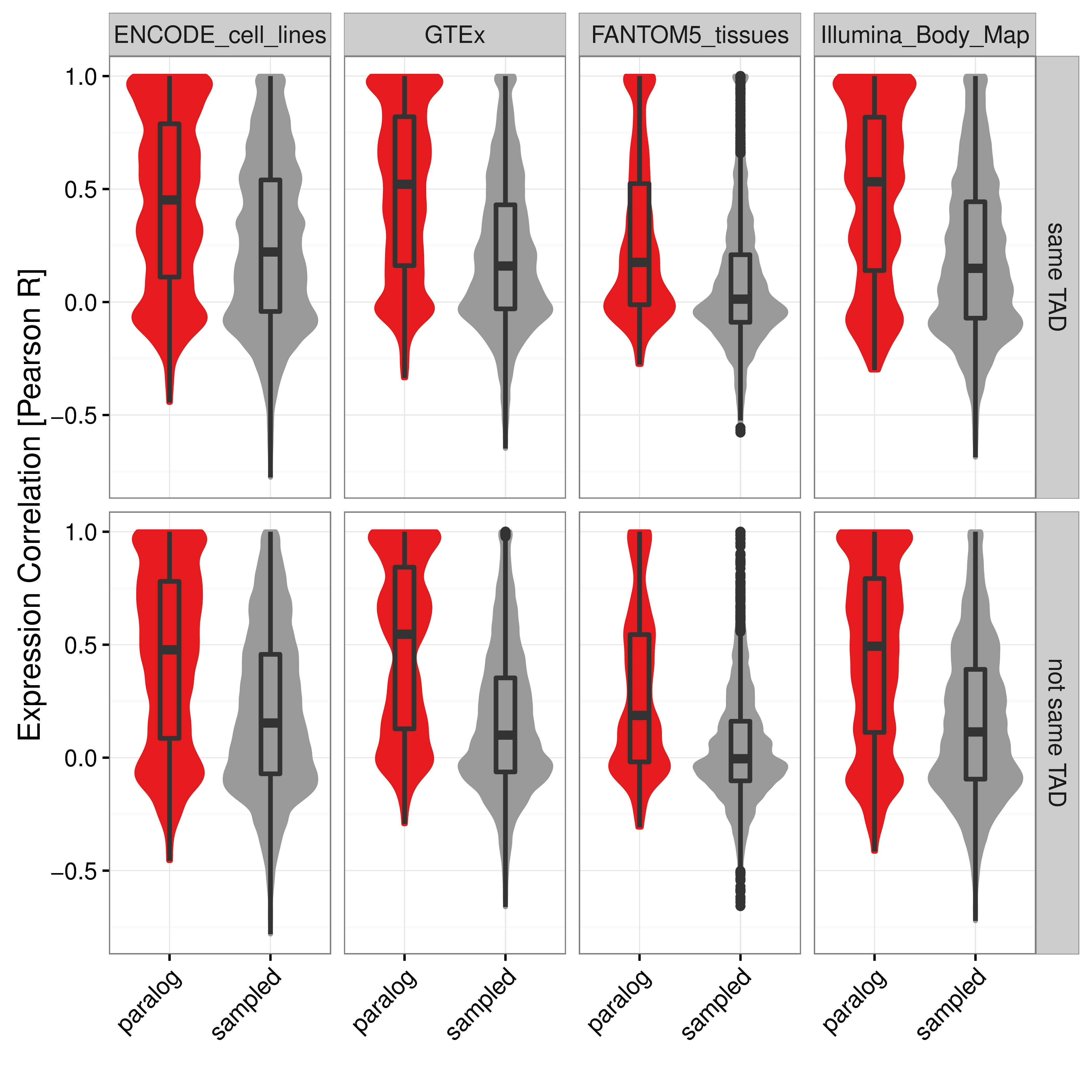
Figure A.10: Distribution of Pearson correlation coefficients of gene expression values in four independent data sets between close paralog gene pairs (red) and sampled control gene pairs (grey) separated for gene pairs within the same IMR90 TAD (top) or not in the same TAD (bottom). Boxes show 25th, 50th and 75th percent quantile of the data and the filled areas indicate the density distribution.
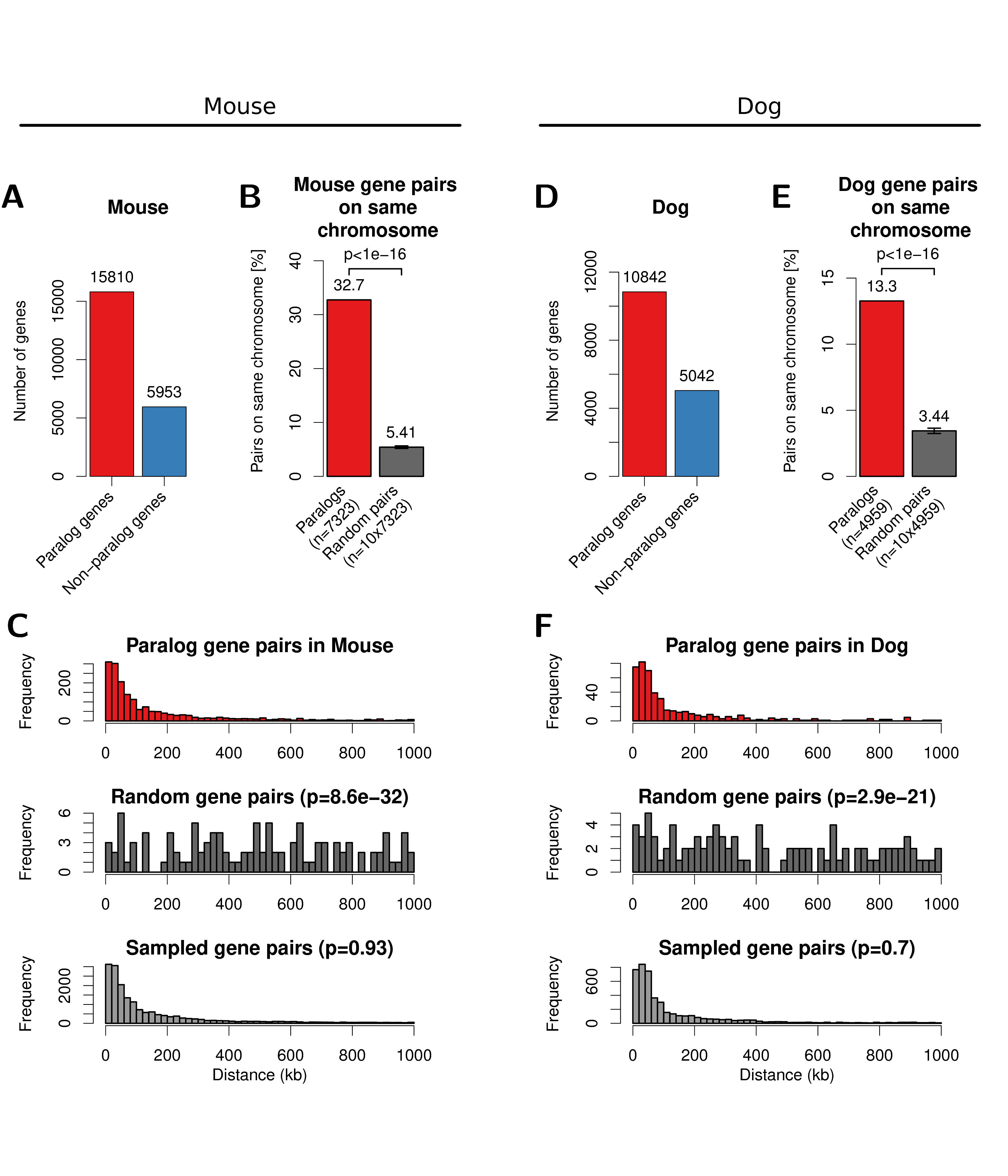
Figure A.11: Paralog gene pairs in mouse (left) and dog (right) genome cluster on chromosome within short genomic distances. (A) Number of genes with paralogs (red) and without (blue) in mouse genomes. (B) Percent of filtered mouse paralog pairs on the same chromosome (red) and random gene pairs on the same chromosome (dark grey). Error-bars indicate standard deviation of 10 times replicated randomizations. (C) Distribution of linear genomic distances between mouse gene pairs for filtered paralog genes (top, red), random genes (center, dark grey) and sampled gene pairs (bottom, grey). (D, E, F) show the same data for the dog genome as figures A, B, C, respectively.
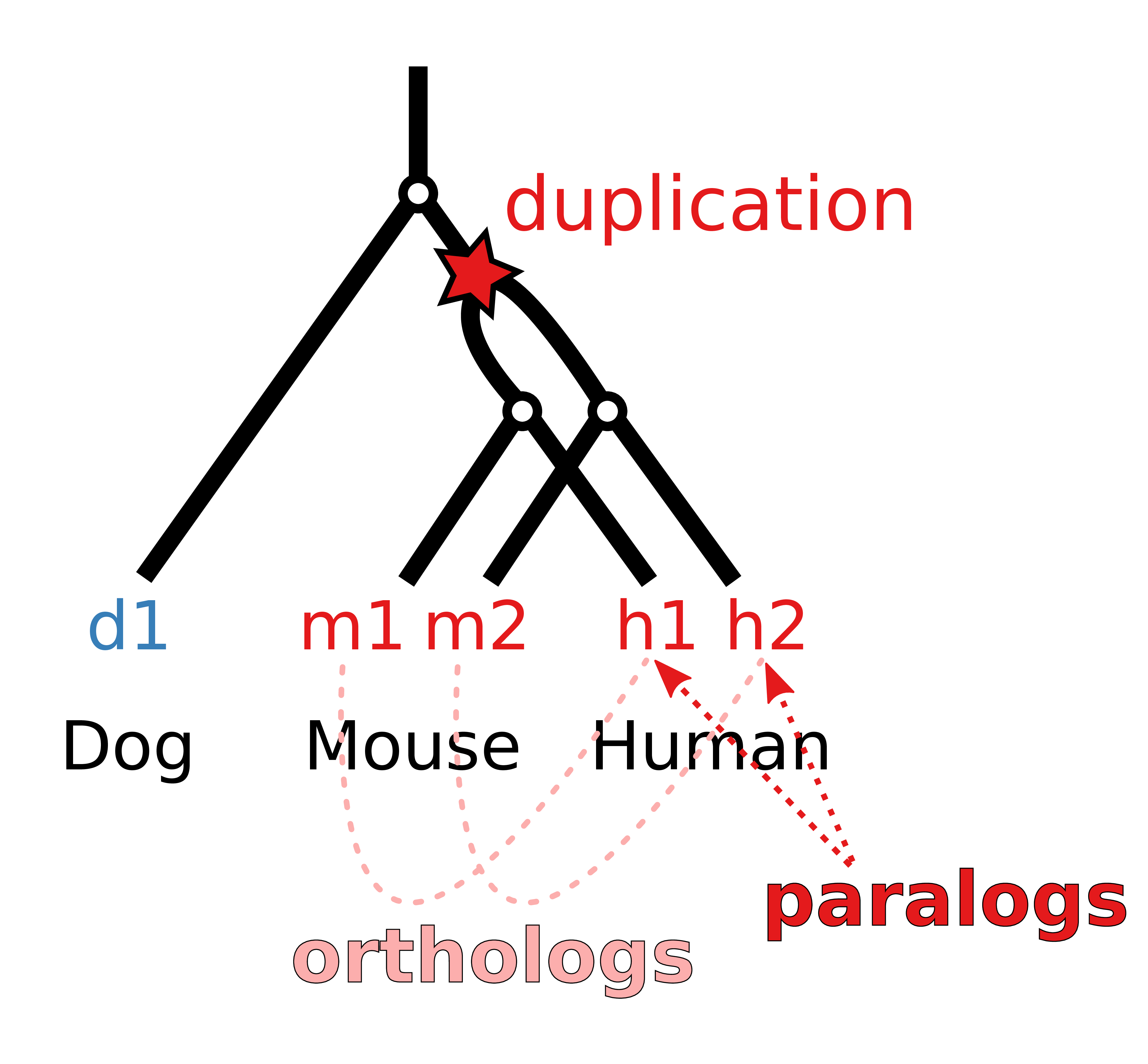
Figure A.12: Phylogenetic gene tree model of a gene that is duplicated before the separation of mouse and human and consequently leads to two paralogs in mouse and human that are one-to-one orthologs to each other and a single ortholog in the dog genome that cannot be assigned uniquely to a human gene.
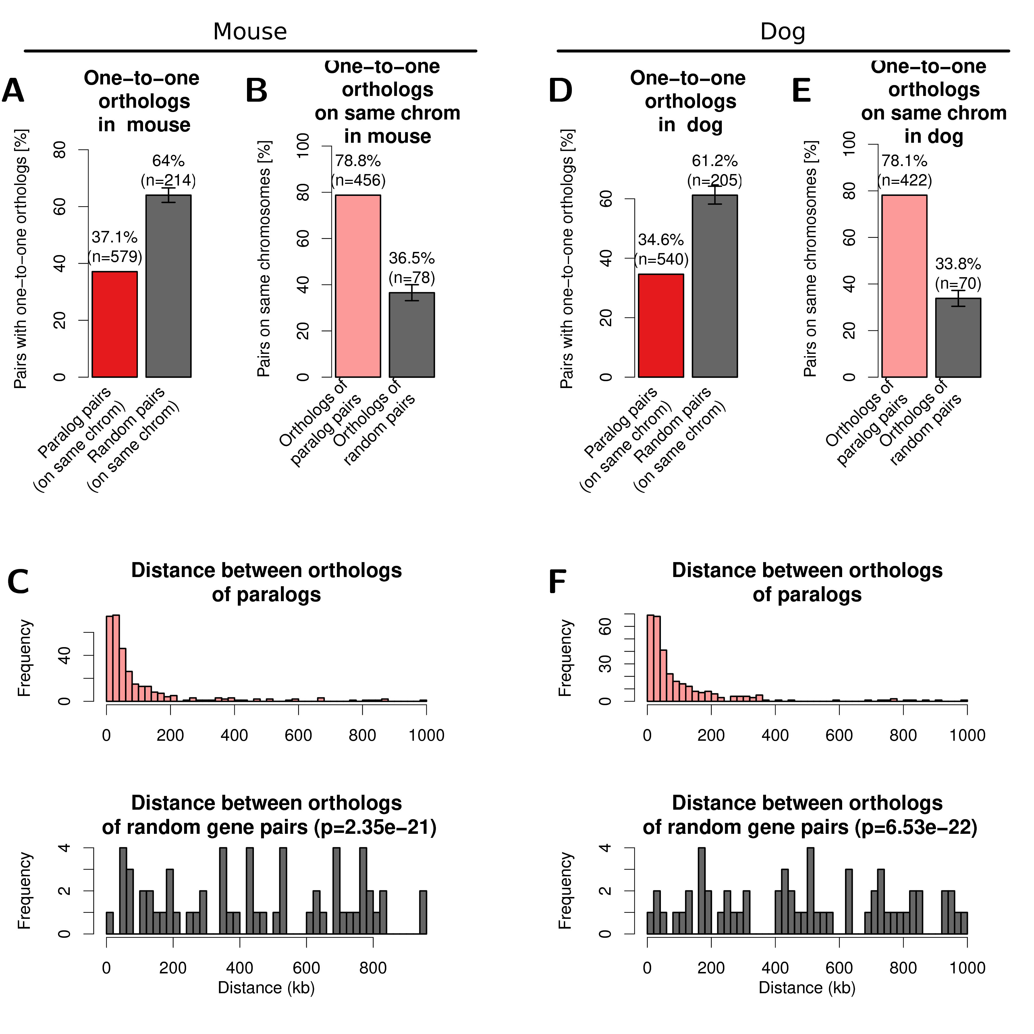
Figure A.13: One-to-one orthologs of human paralogs in mouse (left) and dog (right) genome. (A) Percent of filtered human paralog pairs with one-to-one orthologs for both genes in mouse genome compared to random genes. (B) Percent of one-to-one orthologs on the same chromosome in the mouse genome (light red) and one-to-one orthologs of random human gene pairs on the same chromosome (dark grey). Error-bars indicate standard deviation of 10 times replicated randomizations. (C) Distribution of linear genomic distances between gene pairs for mouse one-to-one orthologs of human paralog gene pairs (top, light red) and one-to-one orthologs of random human gene pairs (bottom, dark grey). (D, E, F) show the same data for the dog genome as figures A, B, C, respectively.
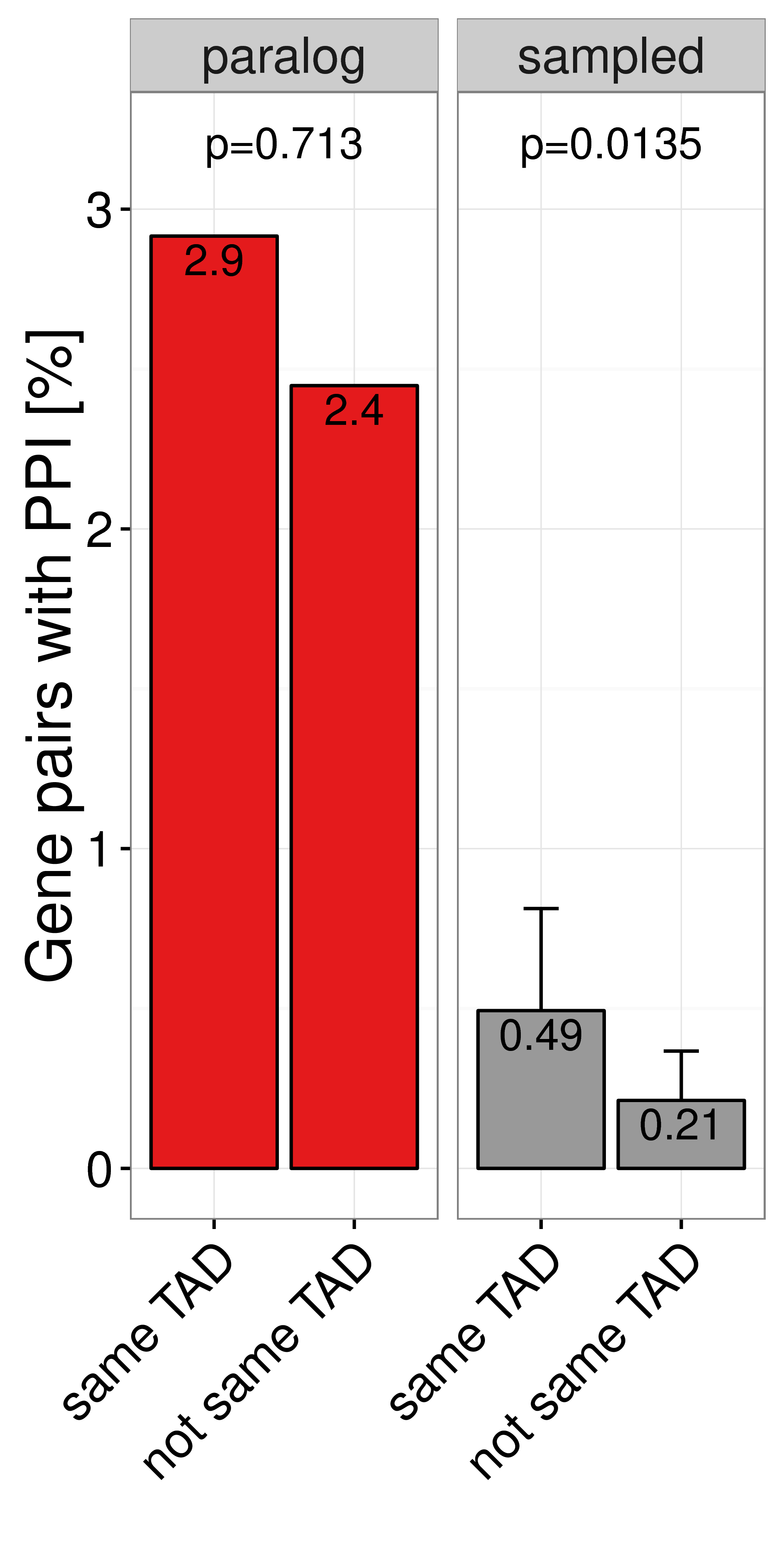
Figure A.14: Percent of close paralogs (red) and sampled (grey) gene pairs in the same IMR90 TAD (left bar) or not same TAD (right bar) that have a direct protein protein interaction (PPI) with each other in the HIPPIE database (Schaefer et al. 2012).